Interview / Manfred Grübl / Friederike Feldmann, Christian Schwarzwald
The Space Between Image and Viewer / Version 4
The Space Between Image and Viewer
Manfred Grübl: What interests me in painting is the possibility of extending two-dimensionality into a spatial dimension. I see this intention in your work as well, and it reminds me of your piece Spööldeel, with the stencil on the wall and the door in front of it. I believe that was a joint exhibition with Alexander Wagner in 2016. You remain within the surface, but there could also be something standing in front of it. Will your work continue to develop in this direction?
Friederike Feldmann: Alexander Wagner’s paintings and my wall painting complemented each other well. The wall painting, which asserted a spatiality through the illusionism of the depiction, was continued by the panels in real space. In my own work, I am interested in real space as a reference field, but since I no longer create stage designs, I don’t work with objects in space anymore. I’m more interested in talking about space within the surface and then confronting that with real space. In my new works, where the writing appears as if it were cut out of paper, that’s exactly what it’s about. You’re right—my interest in the spatial impact of painting is growing again, but I rely on the possibilities of painting itself.
Christian Schwarzwald: For me, it has always been crucial to work two-dimensionally while thinking spatially and touching on the third dimension. I am particularly interested in that transition. In my work, it is often the drawing itself that becomes spatial. Lines and strokes turn into tubes and bars that stand out and cast shadows—a line you could almost grasp—an idea of an image that you can climb into. And I am fascinated by the illusionistic idea of being able to step into a picture, much like in your Wilhelm Busch piece, which somehow reminded me of a children’s room.
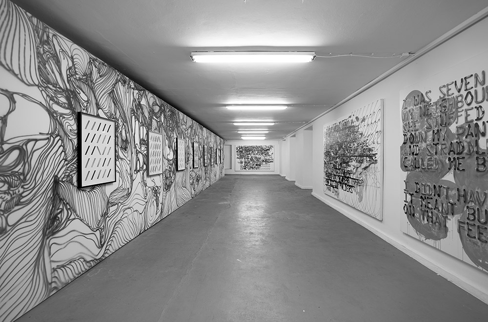
FF: That was exactly the idea. I was looking for the simplest possible architectural form—a table, a surface, lines. It doesn’t get much simpler than that. And for children, tables are like houses or huts…
CS: Or even the primal form of a temple, with columns and a roof that is actually the sky. For me, that fine line between space and image is essential, where material and imagination meet—this membrane where gaze, image, and wall merge. That’s why I have worked for years with space-defining elements like fences, ladders, planks, or pipes. The objects I have drawn were always at a 1:1 scale. I often imitated and copied surfaces like marble or wood, assembling entire spaces completely from drawings. It was always crucial to me that the immaterial, infinite gaze encounters the image as material and space. It’s a bit like how we now constantly interact with images directly on tablets and smartphones, swiping over glass and seemingly touching the images directly. For me, it is essential to take this contact seriously and to ask what a picture actually is. The wall merges with the picture plane, and I find that beautiful. At the same time, it reveals how it is made and that the color itself generates the space. Being able to step into the space means also being inside the artwork.
FF: Many works that place objects in front of a surface actually aim for the opposite effect—to make space appear flat and turn it into an image. The space is understood the peep-box in a theater, where the stage space becomes a surface in the portal.
MG: That depends. There are quite a few examples, like John Armleder or Yayoi Kusama. And even you, Christian, hang paintings on the modified wall. One could argue that this is also a form of object.
CS: I think those are two opposing directions. For me, the focus is on what the image can do and in which realm it operates. The other approach is more about the material and object, it’s about what the picture is composed of and understanding the space with the material.
MG: What role does color play in this? Gilles Deleuze mentions in an interview with Claire Parnet that painting always starts with black and white, and only after a certain time does color come into play. You both use ink, which only comes in specific shades of blue, green, or black. Is that intentional?
CS: For several years, I only created black-and-white images. Then, as my work became more drawing-oriented, I started adding blue as a color. Initially, it was just because blue ink is a standard and ballpoint pens are common writing and drawing tools. But then I also realized that this very light sky blue conveyed a sense of spatial infinity. In the situations in which I drew spatial barriers, i.e. fences, ladders and the like, this sky blue was an infinity factor that I wanted to introduce. One should always be able to see through the images. The barriers strictly defined the space, while the sky blue marked an unobstructed view into the distance. Later, I started incorporating other colors, but I still keep it extremely reduced and usually use only one color for individual works.
MG: Would you say this aligns with Deleuze’s idea that one gathers experience by first working with limitations and only later, after gaining certain insights, begins to introduce color? You are also quite restrained when it comes to color. What significance does color have in your work?
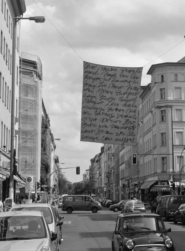
FF: Significance? Perhaps more of a relation or even a mood in a musical sense. The first thing that comes to mind is my work Parole. It was a banner hanging in the streets of Kreuzberg. Inspired by the Agitprop posters that used to be hung over Oranienstraße for May Day demonstrations, I designed a banner with illegible writing. I understood it as the image of a political poster, and the colors practically chose themselves—red and black. For me, those are simply the colors of political posters.
CS: Or quite literally the red flag for the police, who then took it down.
MG: The Bockerer illustrates this well. When the swastika flag is rolled up, it suddenly becomes something completely different because the emblem disappears.
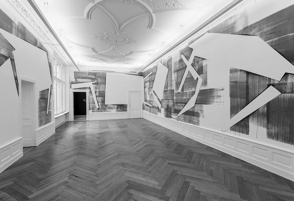
FF: In general, color in my work is more about atmosphere and mood. In my Wilhelm Busch room installation, the exhibition space had a worn-out wooden parquet floor. Since the entire concept of the work was somewhat wooden and woodcut-like, emphasizing wood as a material made sense. The choice of color happens less consciously than defining the form.
CS: The color adds an emotional element that materializes the space in a new way and is therefore completely unpredictable. Especially when working with space, you usually have a clear idea of how to organize it and how certain colors will work. But once you start painting a wall, it’s always a total surprise.
FF: Absolutely. For the Wilhelm Busch project, I used a very wide brush that left visible streaks, and these interacted with the grain of the wooden floor. The result was a strangely wooden room—somewhat oppressive and much tighter than usual. Not just because the color was darker than the usual white cube wall, but also because it suggested wood. That’s what I had hoped for, but I was still surprised by how powerful the effect of the color was.
MG: For me, painting is also about mixing colors. But you mostly use them straight from the tube.
FF: I’ve thought about that recently. I really don’t like mixing colors. It’s strange. Some people are great at it, but when I try, the colors often turn muddy and lose their vibrancy. I’m a fan of tube colors. Paint manufacturers spend years developing the most optimal pigments. Artist paints aren’t mass-produced like margarine—they invest a lot of time and care into achieving the highest intensity and luminosity. And by mixing, I’m destroying exactly that again. What I find exciting is placing colors in relation to each other. First as they come out of the tube, and then, if the relationship doesn’t work or isn’t exciting enough, mixing becomes necessary to create nuances that aren’t available straight from the tube.
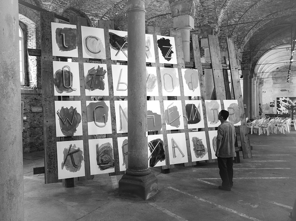
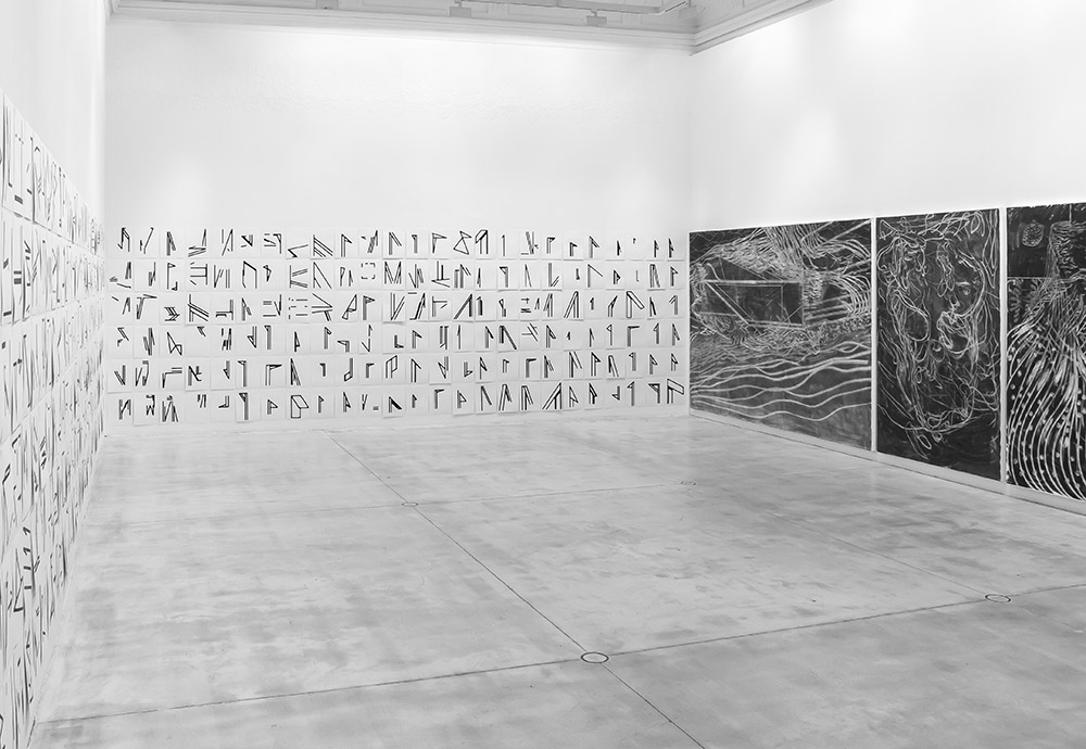
CS: To clarify my decision for a color, I once created an alphabet (ALPHABETCETERA), where I used a selection of tube colors from A to Z— a color palette as a vocabulary of colors, to have a clear reference for making decisions and to maintain some distance from them. I’m also influenced by printmaking, where an image is always broken down into layers. These are graphic layers and also color separations in every printing process. Essentially, you work with color spaces like RGB or CMYK with rasterization, and then you reconstruct the image. I’ve often worked on projects where I tried to make this layering visible and reveal how an image is created. When you bring color into a space and connect it to a material—either fabric or a wall—you experience color in its purest analog form. Screens today advertise millions of colors, pushing the evolution of visual reality on screens to extremes. This creates a growing distance from what analog color actually is. The best place to see this is perhaps in your pavilion where the color on the glass is changed by the light.
FF: The material surfaces are different. There’s more than the millions the computer claims to have.
CS: And then there’s lighting, which varies everywhere. Material and light play a huge role in how color appears. Kids today complain that what they draw with colored pencils never matches the brilliance of the unicorn they see on their phones. It’s a strange abyss that opens up to what the digital image world with its screens presents to us.
MG: Speaking of cell phones and of course all other screens, digital photography is highly exaggerated. Digital images are increasingly adjusted to a common denominator. By contrast older images had completely different colors—less precise, less sharp. Sharpness is a big issue. But how does the digital image impact painting? What do you observe at the university?
FF: Many students want to address digital media in painting, which I understand, but I don’t find it particularly exciting. Painting has always had the ability to absorb other media. There has been and still is a lot of painting based on photographs. You could almost get the impression that observing the world has been replaced by observing photos —and now, virtual images are being quoted and imitated. Painting initially absorbed photography, and now digital images. Maybe that’s part of why it has survived, but I think that’s only a small part of it. What matters more than references to other media is the medium itself: expanding its boundaries, engaging with its history, and continuing its narrative. Perhaps painting has gained new relevance precisely in contrast to digital media.
CS: Painting or working with pictures is always about something fundamental. In your work, Friederike, it’s the layering, the omissions of backgrounds, or the revelation of how something is made—but in a formal, fundamental, and often quite simple way.
FF: When I started painting, I wanted to say something fundamental and relevant—especially about social issues of the time. I see that in students now, too. At some point I realized that it wasn’t about saying, but about doing and showing.
CS: Even though we both use language, writing, and graphic traces, the primary focus isn’t on conveying a message. It’s about something elemental and simple—how images function.
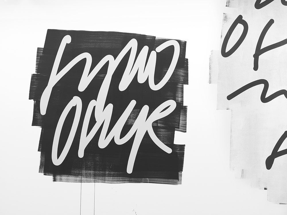
FF: That’s why, in my text-based works like Die Autorin, Schreiben vom … and lyrics, I deliberately made the writing illegible—so that the message is removed, leaving only the gestural, pictorial aspect. That was the point.
MG: Could one say that writing is simply your language? If you don’t understand Japanese or Chinese, they’re just symbols. So, theoretically, every loop or stroke could stand for a letter.
FF: I wouldn’t say that. It might be my voice, but not my language. It’s a trace of my movement. Viewers naturally want to decipher it because they’re used to that. But they still perceive the pictorial aspect subconsciously. Whether a sentence is set in Fraktur or Helvetica makes a huge difference. But what does the visual aspect of writing actually convey? That’s why I started studying old manuscripts—to explore how letters visually shape a page. By being aware of how I design my letter, I naturally convey something. Old legal documents, for instance, are incredibly ornate. And the decoration, casually speaking, the flourish, already belongs in the realm of pictures anyway.
CS: So far, we have all learned to master handwriting at school, but it’s unclear where that’s heading. Handwriting seems to be disappearing. Yet, we fundamentally need a connection between ourselves and the systems, one that each person must learn and create. That’s why, for me, drawing is the most essential form of writing. Normally, writing combines information and form into an image. With foreign characters, all you can really see is the appearance. Like an illiterate person, you assume something is written but can’t decipher it.
FF: Of course I also like to play with this. But ultimately, it’s about authorship. In painting, handwriting is still the term that is closely associated, almost synonymous with authorship. Stroke, handwriting—these are old-fashioned terms with long histories, but they remain relevant. And precisely because the history is so long, it serves as a reliable corrective. It quickly becomes clear what is really new about the new.
CS: I think this has to remain important to us alongside digital developments. It’s this fundamental experience that we all still share. As children, we learn with paper and pencil: drawing a line from left to right. We add figures, flowers, cars. We draw a horizon, and the fascinating thing is that through drawing, we don’t just learn how something appears—we understand that depiction and comprehension of the world happen simultaneously. You only begin to grasp the world through drawing. I mean this quite literally: get a picture. And that is why I believe that we do not simply see the world, but are actually always part of this image that we create for ourselves and that in turn defines us.
MG: There’s a video piece by John Baldessari, Six Colorful Inside Jobs. You can really see how color changes the space, and how the floor becomes part of the composition. What is it like for you to use the floor or ceiling as a work surface?
FF: That’s a strange idea for me. I’ve never really felt the urge to paint on something I stand on. There’s no counterpart anymore—just something beneath me. But I’m interested in that counterpart. It makes a difference whether you have a surface in front of you that speaks about space, or whether you’re inside a painted space. If you paint everything yellow and stand in a fully yellow room, the yellow eventually disappears. It’s like standing under a yellow lamp—at some point, everything looks gray. The question of color is actually much more about relations. If a yellow stands alone, it behaves one way, but if you introduce a purple next to it, something happens to the yellow—that’s when things get exciting. It reminds me of Blinky Palermo, who could create a huge impact in a space with relatively small but precise color interventions. Compared to someone like James Turrell, who works more with total color environments, like the yellow lamp effect.
CS: I want to understand space in my work as simple constructions. If you fold a sheet of paper and stand it up like a book, that’s already a space. You have an X, Y, and Z vector. Space is constituted depending on how the surface relates to the room. I’m also interested in the relationship between the image and the viewer. I started working with ceiling paintings because I was fascinated by the fact that there is actually no top or bottom to the ceiling picture. Depending on how you move around the room, you create your own bottom and top. There’s always a fixed distance to the image, but you can shift your position. Some distance is crucial for perceiving an image. If you hold a book too close, you can’t read it anymore. That’s why incorporating the floor usually doesn’t work for me.
FF: Ornamentation works well on the floor. I was just in Morocco and saw many beautifully tiled floors—or in Venetian churches, for example. The floor is the place for repeating patterns because you can’t take it all in at once, but an ornament like that can be mentally extended. That works.
CS: The floor is always connected to layout and structure, or weight and material. Carpets, for example, create a different sensual reference. I’m also interested in generating attention and concentration. Working in series is a way for me to achieve that. You also have a method of making many drawings and then deciding. You probably know that feeling of needing to get into a flow, to generate a kind of current in order to become precise. I need this flow in order to actually be able to let go, to get to where I have not yet been, so that something really new can emerge. But also with the ease and the full risk that it might go completely wrong. You become both the author and the medium at the same time.
FF: Generating a flow, almost creating something like a routine in order to discover something new. I actually know that. With my drawings, I usually start with only a vague idea of what they should look like. I try to get closer to that idea, which often takes many attempts. Sometimes I make so many versions that my entire studio floor is covered. Through repetition, I gradually get a clearer sense of what I’m actually aiming for. The act of doing shapes the idea. At first, you only have an idea of where you have already been. But then, at some point, an accident happens—some uncontrolled movement creates something new. That’s what makes the process so exciting—things occur that you simply couldn’t have planned. In the end, I choose one version, and the rest goes in the trash. But now that we’re talking about it… Maybe it could be interesting to keep those discarded attempts, to track the process afterward.
CS: Music has always been incredibly important to me, and repetition has a kind of musical logic. I see that same logic in your work, especially in the empty spaces. Music consists of sounds, pauses, lengths, and repetitions.
FF: Yeah, the pause is actually central. The motifs I show are essentially left blank, and the painting happens around them.
MG: Or it gets erased again.
FF: No, not erased. Consciously left open.
www.friederikefeldmann.de
www.christianschwarzwald.net